In this tutorial I am going to walk you through how we setup Moodle to train our teachers and build teacher skills. These are the things we were thinking about when we launched our internal training site for staff. We call our staff training website “MyPD” which stands for My Professional Development. Let’s start at the homepage and work our way through the site as a user to see what kind of configuration and setup is needed at each and every step to ensure as smooth and frictionless user experience as possible. We built the Fordson theme to help provide a better Moodle experience and I am going to walk you through the process of how we use Moodle and Fordson to provide an amazing user experience for our teachers and students.
Areas of Focus
- Custom homepage to market and promote the site
- Easy login
- Large icons, good use of space
- Easy enrollment options and ability to mass enroll our staff
- Distraction free and frictionless experience to login and access training
Tools Used in this Project
The Frontpage Login
 Moodle has a variety of ways to configure the frontpage. You can have an open site or closed site in which you must login to view things. We always choose to keep our sites closed for a couple of reasons:
- We want to know who is accessing our site and have control in what they can see to help guide them to the learning material
- We view our LMS as an extension of the classroom/school and we do not allow the general public to just waltz into a classroom/school
The first thing we do is force users to login (Security > Site Policies > Force users to login). How they login is also critical to ensuring a good user experience. We authenticate users using LDAP or in common terms, their normal employee credentials that they use for everything else from computers to email (Plugins > Authentication > LDAP server). We wanted to provide some context, overview, and promotional material on the site homepage and that is built into the Fordson theme under the Custom Login Page settings. As you can see the custom login page has the login form at the very top of the page and is followed by some marketing icons and text. Below that we provide up to three longform text boxes and images.
The Homepage Features
 Once authenticated and logged in, we can now get down to the business of learning. How this happens will depend on what you want to accomplish as an organization. Unlike other LMS’s, Moodle doesn’t have a predefined plan for how your users move about the site. It means you must think about how you want users to find courses, enroll in courses, and complete the tasks and goals of the courses. This is where planning and talking to a good Moodle admin is critical. Good thing you have Moodle.org Forums to help!
There are two basic landing pages for the Moodle homepage once authenticated and those are: the Dashboard and Site Homepage. The Dashboard is great if you automate each and every enrollment. The Site Homepage is the landing page we prefer because we provide special tools and navigational elements to help our users. These features and tools are unique to the Fordson theme and are meant to guide and direct the user to learning material.
Sometimes organizations and Moodle admins put a bunch of non-essential information on the homepage such as blocks, text, images, and videos thinking it will make things easier on the end user. We do not think that way. We want our homepage to be as clutter-free as possible and focused on getting a user from the homepage to learning as quickly as possible. Our homepage has three main features we will discuss below.
Course Code Enrollment
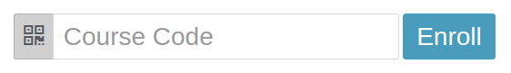
We wanted a way to enroll users directly from the homepage into any course in our site. We built an amazing plugin called Easy Enrollment which assigns a unique 6 digit code to every course and group in the entire site. With this enrollment code a student can type in the 6 digit code right on the homepage and when they click the enroll button they are instantly transported to the course and enrolled. The student can now begin learning. While this works VERY nice and is key when new staff is hired, we didn’t want everyone to have to enroll so we utilized a great little plugin that allows for mass enrolling of users based off a CSV file. This plugin was able to get almost 99% of our staff into the proper courses without any effort on their part. We always strive to make it as convenient for the end user as possible.
Icon Navigation Bar
![]()
The Icon Navigation Bar allows for a very visual navigation element to point a user to the main areas of the site. The default 4 buttons are: Dashboard, Badges, Calendar, and Course Directory. These can be removed or changed to point to any website or webpage. There are a total of 8 buttons that can be added to this menu. In addition to the 8 possible icon buttons you also get two special buttons: Create a Course and Special Slide. The course creation button will only appear if a user has permissions to create a course. The special slide button is a great way to show and hide information from a textbox. This is good for news, overview of tools, how to get/find help and other information that doesn’t need to be displayed on the page permanently. Icon Navigation can be configured in the Fordson theme settings on the Icon Navigation tab.
My Courses

This is not unique to our Fordson theme but the way the courses are displayed is. This area let’s the user know what courses they are enrolled in and provides quick access to the learning material once a user logs into your site. A unique feature of Fordson is that these courses are displayed in the order of last access. Meaning the courses a user accesses most frequently will appear at the top of the list.
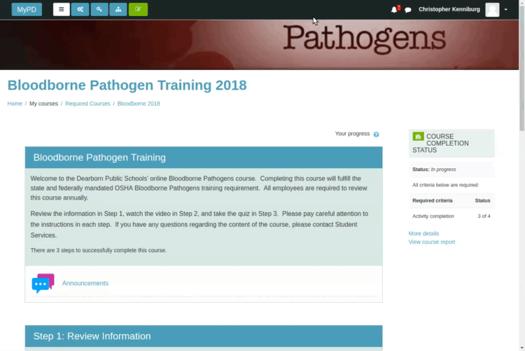
Course Page Design
 Once a user is past the login and homepage of the site they are engaging in the learning material. The Fordson theme has many settings which allow for customization. Let’s take a look at the page layout and features Fordson offers that help make using Moodle an enjoyable experience. We’ll also identify some settings that we changed specifically for staff training to draw attention to various areas of the page.
The Fordson theme utilizes color, space, and other elements to better display the learning content to the user. In the following section we will start at the top and work our way down the page.
Top Navigation Bar
![]() This area of the page is always visible. It is the very thin bar at the top of the page and contains all of the navigational elements such as course specific items to the left and user specific items to the right. Let’s look at the buttons starting on the right.
This area of the page is always visible. It is the very thin bar at the top of the page and contains all of the navigational elements such as course specific items to the left and user specific items to the right. Let’s look at the buttons starting on the right.
The sitename will return a user to the homepage. Next is a button which looks like a hamburger with 3 horizontal lines will toggle the nav drawer on the left side of the page revealing all your course specific links. The button with the gears does two things depending on your role. If you are a teacher it will will display course management links in a modal window. If you are a student it will display a course overview/dashboard with useful information such as completion and course contacts in a modal window.
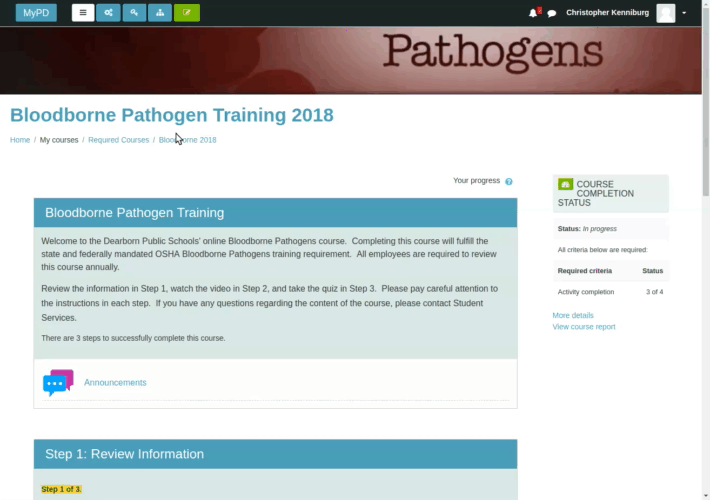
The next button only appears if the theme detects the activation of the Easy Enrollment Plugin which will take you to a page where you can see all your enrollment codes. For site administrators the next button will take you directly to the backend of Moodle and allow you to access all the administration areas of Moodle. The last button is green and allows teachers to turn editing on and begin building their course. The best part of the Fordson editing button is that it can be accessed from anywhere on the page and it will return you to that specific part of the page instead of the very top. Check it out here…
On the right hand side you have alerts, messages, and your profile links. These are all the user-centric links and personal to the logged in user.
Course Content Header Area

At the very top of every course page a teacher can customize their own course by uploading an image into the course summary files. This image will be stretched and re-sized to fill the entire length of the header image area. You can find size and other settings under Appearance > themes > Fordson > Custom Image Settings. Below the image is the course title followed by the breadcrumb navigational element. Again, you can make the image larger from the theme settings page. For staff training we chose a slimmer and smaller image size. For K-12 students we might want a slightly larger area so that the image helps the student identify what class they are viewing. Visual cues are highly relevant when dealing with younger learners and it helps with older learners as well to provide an inviting appearance.
Main Content – Topics
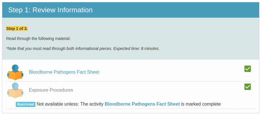
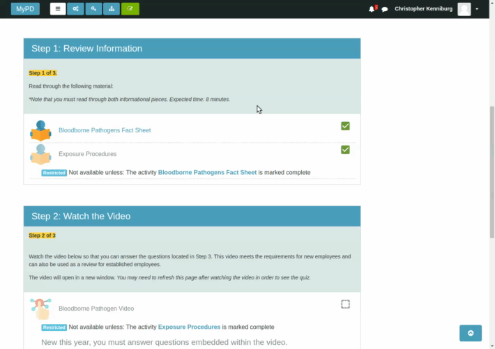
The main topics utilize color and spacing to help separate the topics and learning materials. The topic titles are highlighted in a solid blue bar and below that title is the topic summary which is a slightly lighter shade of blue. Both the title and summary are a darker color on the screen and the whole topic is outlined with a thin border to create a sense of containment. Below the summary the MyPD site utilized large icons for activities and modules. The size of the icons is easily set in the theme settings (Appearance > Themes > Fordson > Content Areas > Activity icon size). The default is 32px and these are 56px. The activities have a dashed line underneath each one as it helps mimic the look and feel of lined paper from elementary days. When you hover over each activity they display a yellow background color to further help the student visually. The larger activity icons work well for our staff training site because we know each course will have limited items for training. It also helps staff quickly see what needs to be completed in a course.
Conclusion
We designed Fordson with a variety of features that makes it suitable for multiple uses. From navigation to activity icon size we look for various ways to improve core Moodle functionality and experience. This example of using Moodle for staff training isn’t very special but the end result is a smooth and friendly user experience.
We hope you found this overview to be helpful.